There have been rumblings about the effect the ugly cars will have on F1, most notably from Paul Hembery of Pirelli, who has expressed concern that the new designs may put people off tuning in to watch the races. I respect Paul's opinion, and he seems to be pretty spot on with a lot of his views on F1, but I'm not sure I agree on this one. I don't think non-F1 advocates or casual fans will particularly even notice the change in the cars, much less be made less likely to be converted by the wonky-noses. Its generally only the more hardcore of us that really have any firm opinion on what a beautiful F1 car looks like. And conventional wisdom says the last truly good looking F1 cars are from the mid-90s, and F1 has attracted a decent mix of hardcore and casual fans since then! The people who may be put off are us hardcore fans, but what we really care about is the quality of the racing. If the new cars put on a good show this year, we'll be in no danger of changing channels.
None of which should suggest I actually like the new cars. I don't. They look wrong. I think that because the change has come from a safety perspective (combined with the teams feeling unable to reduce the area around the front suspension) it makes an intrusive dent in the 'natural' flow of the design. The same issue made the look of the 1996 cars look odd too, with safety changes leaving the cockpit sides looking like they featured pre-deployed airbags. Eventually however, a better solution was found and the padding bedded into the designs more. Let's hope after seeing the 2012 cars the FIA and the teams can sit down and find a more elegant solution for future years! Not for the casual fan though, but for me - they are goning to hurt my eyes at 6am for the early race starts!
Some of the cars with wonky-nose-syndrome look better than others. Red Bull have at least had the grace to make theirs a vent so it looks like it was supposed to be there. I was glad to read in Mark Hughes' Autosport column that I'm not the only one cynical about Adrian Newey's assertion the vent is just for driver cooling! On the Lotus the nose-wobble gives the JPS-style gold stripes an extra few curves to look gorgeous on, which is never an entirely bad thing.
The car that really does look like it was beaten with an ugly stick is, sadly, the new Ferrari. But for me the worst part is that gaping mouth at the front of it, making it look like a Basking Shark sweeping the race track for Plankton. Maybe it's after some of those bugs from the Silverstone race last year. Can you fuel a car on bugs?!

- Badger F1 Top 5 Ugly F1 - Personally I love Damon's '92 Brabham!
- Axis of Oversteer Flickr Gallery - the Eiffelland car gets my nod here, just for that wing mirror!
- Bleacher report Gallery - plenty to argue over here!
I do have to give a shout in favour of one car that always gets dragged up in discussions of ugly f1 cars - the Williams FW26. It seems most people hated this car, and I've always felt a lone voice in favour of the design, which I thought looked aggressive and purposeful. The results just didn't come for the FW23 until they switched the 'Walrus' nose for a more conventional and bland layout, which annoyingly went on to win a Grand Prix, meaning the detractors were proved right. I hate it when that happens!
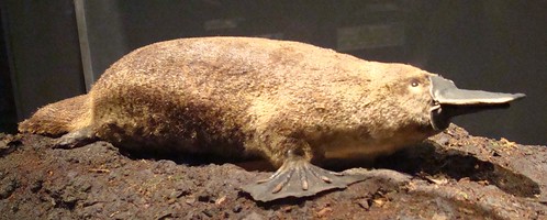
Anyway, it gives me another excuse for an F1 / animal lookalike to add to the Platypus and Shark above. If anyone else has any other animal impersonators they want to share either add them to the comments or tweet them to @chrispageng and I'll share them, around! Cars or drivers, but don't be too mean folks!

Picture credits for the images above:
- Platypus
- Ferrari 2012
- Basking Shark
- Williams FW26
- Walrus
No comments:
Post a Comment